Compliant Signs
In the intricate world of architecture and interior design, every detail plays a significant role, not just in aesthetics but in the functionality and accessibility of a space. Few elements are as fundamental to this balance as compliant signs with ADA guidlines. A subtle necessity, these signs fulfill a crucial role in facilitating the navigation of all individuals within a built environment, regardless of their abilities. With a rich background in the sign industry, we have accumulated extensive experience in designing and producing ADA compliant signs. We are excited to provide you with valuable information to enhance your next project. Consider this as a helpful guide, offering insights rather than an exhaustive list. We provide free consultations and are genuinely pleasant people to chat with!


Understanding What Makes a Sign ADA Compliant
As per the guidelines set by the Americans with Disabilities Act (ADA), compliant signage is a non-negotiable component of any public or commercial space, ensuring that people with visual impairments, cognitive disabilities, or individuals who rely on mobility aids can navigate with dignity and minimal assistance. Here are some key features of ADA-compliant signs:
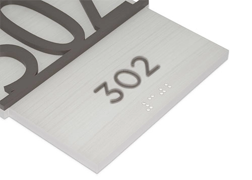
- Braille and Raised Characters: Text on ADA signage must not only be printed but also represented in Braille and raised characters for tactile reading.
- Contrast in Colors: Signage should maintain a significant contrast between background and text colors, ensuring readability for those with low vision or color blindness.
- Non-Glare Finish: All ADA signs must be designed with a non-glare finish to reduce potential visual challenges for all users.
- Placement and Height: ADA regulations specify the correct height and placement for all types of signs to guarantee visibility and ease of access for everyone.
Going Beyond Compliance: The Aesthetics of Functionality
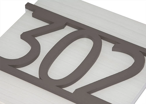
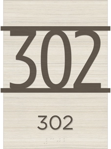
While the requirements for ADA signage are stringent, they do not have to limit the visual appeal of the space. Many architects and interior designers are embracing these guidelines to craft visually engaging and harmonious signages. Contrary to the outdated perception that ADA-compliant signs are unsightly, modern options in materials, finishes, and mounting styles allow for innovative and distinctive designs that seamlessly integrate into any environment.
Selecting materials that offer versatility and durability is key. From stylish options like brushed metal and wood to more contemporary acrylics, the right selection can enhance the aesthetic appeal of any space. Incorporating these elements into the overall design plan can lead to a cohesive and inclusive environment that not only meets ADA standards but also speaks to the thoughtful design ethos of the builder.
The Significance of Inclusive Design
Thoughtful ADA signage embodies more than mere conformance to regulations; it represents a commitment to the fundamental principles of inclusive design. It acknowledges the diverse needs of all individuals, celebrating the richness that inclusivity brings to our shared spaces. In the journey of creating accessible and welcoming environments, every decision towards inclusive design, including the choice of signage, reflects our values and aspirations as builders and designers.
As the architectural and design communities continue to champion inclusivity, the role of ADA signage will remain pivotal. By balancing functionality with aesthetic considerations, we advance towards spaces that are not just functional but inspirational, and accessible to all. In this quest, the collaboration between architects, designers, and ADA sign makers becomes an exciting venture into the unexplored realms of inclusivity and creativity.
ADA signs constitute an essential part of making spaces welcoming and navigable for all. As builders, designers, and architects, it’s crucial to consider the guidelines for ADA compliance, leading to the creation of environments that reflect care, attention, and a commitment to inclusivity.
Ready to elevate your signage? Contact Innovative Sign Systems today for expert design, permitting, and installation services that make your brand stand out. Request a consultation today.
]]>